Flash Development

The first part of the app I worked on was the contents page, investigating new tools and stop motion presets that would help me design the product that I wanted. The Channel 4 logo takes up a majority of the first third of the slide as its important to establish the company producing this TV segment where as the only other inclusion of an image is a small bottle in the corner of the screen for the forwarding button. As I was originally going for a minimalist approach my intent was to have a plain white background however after asking my peers I decided that a pastel blue still offered the minimalism I was after but also provided an inviting atmosphere to viewers. I kept the animations of

the first slide basic as I was new to the Flash app and wanted to secure a basic knowledge of the actions first before attempting more intricate designs. The only part of the slide that doesn't use a motion preset is the "Start" button this is because I wanted a discreet way of indicating that the animations have finished and the appearance of the button telling you to move on does exactly that. I used basic coding throughout the app, using code to stop slides after all animations are complete and link the buttons in the app to their designated pages as well as making sure the animation on that page plays as well.

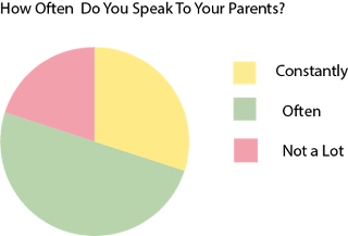
A majority of my slides include graphs created in Adobe Illustrator using the data collected from the previous surveys as well as statistics discovered online that back up the information I found out. The graphs created could be imported as PNG files into Flash ensuring that the quality of the graph and the proportions of it stay as high and accurate as possible. After making the graphs the right size in order to add a motion animation to them, you need to convert them into symbols which allows the image become more pixelated if you alter the size too much afterwards. The graphs in the app not only provide an easier way of absorbing the information but also allow audiences to skim over the information provided but still understand the conclusions we've come to with the information provided. The vector graphics below the graph were also created in Illustrator not only to add to the aesthetic of the app but also to add to the overall simplistic statistics designs I was going for in order to break information up.
The Channel 4 logo is featured throughout the app in the top left corner of the as a channel motif, another consistency throughout the app is the appearance of the buttons. I created them as a minimalist button design in PhotoShop and is repeated throughout as a button to change back and forth, by keeping this feature the same it enables a more easier experience for audiences as consistency can make them more familiar with the app triggering a stronger liking to it. The softer colour scheme was also a key consistency, using varying colours in order to draw audiences in but ensuring that they weren't too vibrant and intimidating and that they wouldn't clash in an unflattering manner. I used secondary research found online throughout the app in order to support claims or indicated a conclusion we can create between the evidence the two present but only used my own statistics or the graphics.
https://www.theguardian.com/education/2003/may/29/research.highereducation4
http://www.telegraph.co.uk/news/uknews/6012322/Teenagers-most-influenced-by-celebrities.html
https://ed.stanford.edu/in-the-media/teens-today-feel-overwhelming-pressure-succeed


No comments:
Post a Comment